You may have seen maps of Europe where a word is translated in to the national language of every country, and it reveals heaps of fun patterns. Well, someone has crafted the app so that we can all make such maps.
My favorite. Why? Because even in France, they call email email. In Quebec, with its insecurity, courrier or something like that. I forget now that I have moved.
My second favorite. Why? Beer. Very useful!
Anyhow, have fun and let me know if you find any amusing results.
Showing posts with label maps. Show all posts
Showing posts with label maps. Show all posts
Monday, January 13, 2014


Sunday, July 28, 2013
Visual Perspective Sauce
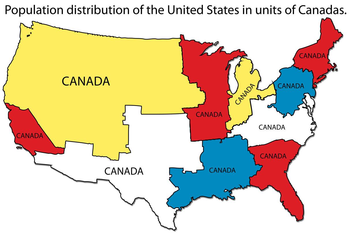
When pondering US-Canadian relations, this tweet and map might be useful:
Just something to think about.
#Map of population distribution of the #UnitedStates, using the unit of "Canadas". #GISbuzz pic.twitter.com/aMzIZS2Eu4
— All things mapping. (@GISbuzz) July 23, 2013
Just something to think about.
Monday, June 24, 2013
When Being Top Ten Is a Bad Thing
The annual list of Failed States is out at Foreignpolicy.com. My reaction as always: any country above Afghanistan must be truly f@#$%-ed. This year, that list includes Yemen at 6, Chad at five, South Sudan (4th) is actually just a smidge behind Sudan so secession works (?), DRC at two, and Somalia at number 1. Zimbabwe lost its "worse than Afghanistan" status from last year and fell to tenth in the world.
The other thing that I noticed is that China is also in dark red on the map. Sure, it is 66 (so I think the colors should be reset so that a country that is one third down the list is not the same color as the top 10 or 20 or 30), but that China is critical? I guess it scores poorly on demographic pressures, uneven development, group grievances, human rights, and so on.
One can pick apart any ranking (a Spew specialty), but the list is instructive in a variety of ways. The "worse than Afghanistan" group reminds us of the countries that tend to get far less attention but are in worse shape. Is that an indicator of ISAF's success? Well, since external intervention is seen as a a variable tied to more fragility (Afghanistan is a 10, Somalia a 9.4 on a scale of 10 is failed, one is Canada), perhaps not. Is Libya a success at 54 on the list since the external intervention was temporary? So confused.
The US is stable but Canada, and the Scandavians, Germans, Swiss, Austrians and Aussies are most stable. After the Snowden affair, perhaps the US dips further down just on the basis of pathetic government competency (both having contractors hire folks like this and then not catching him).
Anyhow, take a look at the map, the tables and the associated articles. Much to chew on.
The other thing that I noticed is that China is also in dark red on the map. Sure, it is 66 (so I think the colors should be reset so that a country that is one third down the list is not the same color as the top 10 or 20 or 30), but that China is critical? I guess it scores poorly on demographic pressures, uneven development, group grievances, human rights, and so on.
One can pick apart any ranking (a Spew specialty), but the list is instructive in a variety of ways. The "worse than Afghanistan" group reminds us of the countries that tend to get far less attention but are in worse shape. Is that an indicator of ISAF's success? Well, since external intervention is seen as a a variable tied to more fragility (Afghanistan is a 10, Somalia a 9.4 on a scale of 10 is failed, one is Canada), perhaps not. Is Libya a success at 54 on the list since the external intervention was temporary? So confused.
The US is stable but Canada, and the Scandavians, Germans, Swiss, Austrians and Aussies are most stable. After the Snowden affair, perhaps the US dips further down just on the basis of pathetic government competency (both having contractors hire folks like this and then not catching him).
Anyhow, take a look at the map, the tables and the associated articles. Much to chew on.
Saturday, June 8, 2013
Fun with Maps: US/Canadian Borders edition
A friend put this on his FB page and I found it so instructive I am putting it here:
The joy of non-straight lines. I didn't know that there was a no-touching zone between the US and Canada. Ah, the joy of google earth and all that. Once again, we are reminded that path dependence uber alles! I probably should have posted this next month in between Canada Day and Independence Day, but I have a short memory.
Speaking of short memories, I noticed in today's paper a guide to real estate that included a particular township just west of Kingston (where I will be next week for the Kingston Conference on International Security): named Loyalist. Yep, Loyalist as in those who preferred the King to the Revolution and fled north. Looking forward to the conference but not to meeting any Loyalists.
The joy of non-straight lines. I didn't know that there was a no-touching zone between the US and Canada. Ah, the joy of google earth and all that. Once again, we are reminded that path dependence uber alles! I probably should have posted this next month in between Canada Day and Independence Day, but I have a short memory.
Speaking of short memories, I noticed in today's paper a guide to real estate that included a particular township just west of Kingston (where I will be next week for the Kingston Conference on International Security): named Loyalist. Yep, Loyalist as in those who preferred the King to the Revolution and fled north. Looking forward to the conference but not to meeting any Loyalists.
Saturday, May 18, 2013
Comparative Xenophobia, part III: The Quickening
Over the past couple of days, Max Fisher has posted a few maps and some commentary about global comparisons of ethnic tolerance and diversity. This led to as series of spews as I had more than a few thoughts about this stuff, which Fisher was kind enough to summarize back at his Washington Post blog.
I promised in the initial post to get to the relationship between economic freedom and tolerance that was a key issue raised in the first piece on tolerance. I got distracted by the second post, but now I can try to remember what I was thinking two days ago.
Fisher reports that the study he is analyzing finds that economic freedom has no correlation with racial tolerance but does with tolerance of homosexuals. So, we have two separate findings--do they have a common logic? It depends on what one considers to be the sources of racism versus the sources of homophobia. Do all forms of discrimination and animus have the same logic? Maybe, maybe not.
Some caveats:
So a few comments on this data. Note that the US and the Scandinavian countries are in the same category. This tends to run against what libertarians generally think--as the social democracies of Europe tend to have much more government intervention in the economy. All I can say is that a map having Sweden and the US in the same category tells me that the economic freedom that is meant here is not that which tends to jibe with popular views of that concept.
I promised in the initial post to get to the relationship between economic freedom and tolerance that was a key issue raised in the first piece on tolerance. I got distracted by the second post, but now I can try to remember what I was thinking two days ago.
Fisher reports that the study he is analyzing finds that economic freedom has no correlation with racial tolerance but does with tolerance of homosexuals. So, we have two separate findings--do they have a common logic? It depends on what one considers to be the sources of racism versus the sources of homophobia. Do all forms of discrimination and animus have the same logic? Maybe, maybe not.
Some caveats:
- I am not an expert on homophobia, so I am going to have to speculate a bit. Yes, I should do a heap of reading, but my blog is not my day job.
- The data on tolerance may be flaky as the various Fisher and Spew posts suggest.
- The data on economic freedom is from institutes that are ideologically committed to less government. It does not mean that their data is necessarily wrong, but it is something to keep in mind.
 |
| Fraser Institute, www.freetheworld.com |
So a few comments on this data. Note that the US and the Scandinavian countries are in the same category. This tends to run against what libertarians generally think--as the social democracies of Europe tend to have much more government intervention in the economy. All I can say is that a map having Sweden and the US in the same category tells me that the economic freedom that is meant here is not that which tends to jibe with popular views of that concept.
Friday, May 17, 2013
Comparative Xenophobia, part II
I had intended to address the relationship between economic freedom and tolerance that was part of Max Fisher's post yesterday, but his post today pushed a couple of buttons that require a quick reaction.

To be clear, I am a big fan of Max Fisher and his infographics. They make me think, and I could always use more of that. He is quite judicious in today's post on ethnic diversity that the diversity and conflict (yesterday's map, sort of) do not line up neatly. And he does deploy the key "money quote":
This is why I show in my ethnic conflict classes both the classic Star Trek episode (black/white vs white/black and the Babylon 5 episode where ethnicity is randomly assigned (purple vs. green) via scarves pulled out of a box. Ethnicity is not primordial (sorry, Robert Kaplan), but constructed with social and political meaning that is attached but changes over time due to politics and context. This money paragraph that Fisher quotes basically sets up the puzzles of the contemporary study of ethnic conflict: when do people support politicians who use identity to divide and to coordinate and when do they not? Not all appeals based on ethnicity work (David Duke, anyone?).
So, heaps of good stuff in this piece, especially the end. I just want to address to conventional wisdoms that come up that are problematic. That is, they are my pet peeves.
To be clear, I am a big fan of Max Fisher and his infographics. They make me think, and I could always use more of that. He is quite judicious in today's post on ethnic diversity that the diversity and conflict (yesterday's map, sort of) do not line up neatly. And he does deploy the key "money quote":
In general, it does not matter for our purposes whether ethnic differences reflect physical attributes of groups (skin color, facial features) or long-lasting social conventions (language, marriage within the group, cultural norms) or simple social definition (self-identification, identification by outsiders).* When people persistently identify with a particular group, they form potential interest groups that can be manipulated by political leaders, who often choose to mobilize some coalition of ethnic groups (“us”) to the exclusion of others (“them”). Politicians also sometimes can mobilize support by singling out some groups for persecution, where hatred of the minority group is complementary to some policy the politician wishes to pursue.
* I do appreciate the idea that the kind of identity does not matter so much (my view of ethnicity includes religion as well as race, language, and kinship as potential shared attributes that tie the group), although one could argue that certain kinds of divides have somewhat different dynamics.
This is why I show in my ethnic conflict classes both the classic Star Trek episode (black/white vs white/black and the Babylon 5 episode where ethnicity is randomly assigned (purple vs. green) via scarves pulled out of a box. Ethnicity is not primordial (sorry, Robert Kaplan), but constructed with social and political meaning that is attached but changes over time due to politics and context. This money paragraph that Fisher quotes basically sets up the puzzles of the contemporary study of ethnic conflict: when do people support politicians who use identity to divide and to coordinate and when do they not? Not all appeals based on ethnicity work (David Duke, anyone?).
So, heaps of good stuff in this piece, especially the end. I just want to address to conventional wisdoms that come up that are problematic. That is, they are my pet peeves.
Thursday, February 14, 2013
Love Is All Around Us
Unless you happen to live in Mongolia, various Stans, Syria, and Belarus:
Morocco also stands out.
The other way to enjoy Valentine's Day as a Political Scientist to follow the #PoliSciValentines thread on twitter. My contributions:
The title of this post was inspired by Love Actually, but here is what I found online.
Enjoy your VDay.
 |
| http://www.washingtonpost.com/blogs/worldviews/wp/2013/02/14/a-color-coded-map-of-the-countries-where-people-feel-the-most-and-least-loved/ |
Morocco also stands out.
The other way to enjoy Valentine's Day as a Political Scientist to follow the #PoliSciValentines thread on twitter. My contributions:
Also, today, it was revealed that Canada is extending the C17 mission to Mali for another month. That is lovely in two ways--to help Mali and to make my one solid prediction quite accurate. I said on the various TV spots that the first and then second deadlines for the mission were unrealistic and that I expected the mission to be extended yet again. Whoo hoo me!
The title of this post was inspired by Love Actually, but here is what I found online.
Enjoy your VDay.
Thursday, February 17, 2011
Fun with Maps!
Sociological Images posted a few maps about the consumption of alcohol. As a student of international relations and a johnny-come-lately to beer-swilling, I thought these were interesting:

Not too many surprises here: countries with high percentages of Muslims drink less and Russians drink far more. Apparently, the reputation of Aussies to be hard-drinkers is well-deserved. That most of Europe fits into the highest categories might be a bit of a surprise. One might think it is all that wine, but not entirely so, as the next map suggestions:

Again, no surprise that it is beer for North American and Australia and spirits (Vodka) for Russia. Not sure what is other, which seems to be only widely drunk in Africa. Not surprising that Italy and France stand out as wine-drinking countries, but Spain as a beer country? This map does suggest that beer is popular in more countries (woohoo!), although with India and China in the spirits category, that is enough to make spirits #1 in total consumption (my guess).....
Any other thoughts on the distribution of boozing?

Not too many surprises here: countries with high percentages of Muslims drink less and Russians drink far more. Apparently, the reputation of Aussies to be hard-drinkers is well-deserved. That most of Europe fits into the highest categories might be a bit of a surprise. One might think it is all that wine, but not entirely so, as the next map suggestions:

Again, no surprise that it is beer for North American and Australia and spirits (Vodka) for Russia. Not sure what is other, which seems to be only widely drunk in Africa. Not surprising that Italy and France stand out as wine-drinking countries, but Spain as a beer country? This map does suggest that beer is popular in more countries (woohoo!), although with India and China in the spirits category, that is enough to make spirits #1 in total consumption (my guess).....
Any other thoughts on the distribution of boozing?
Subscribe to:
Posts (Atom)